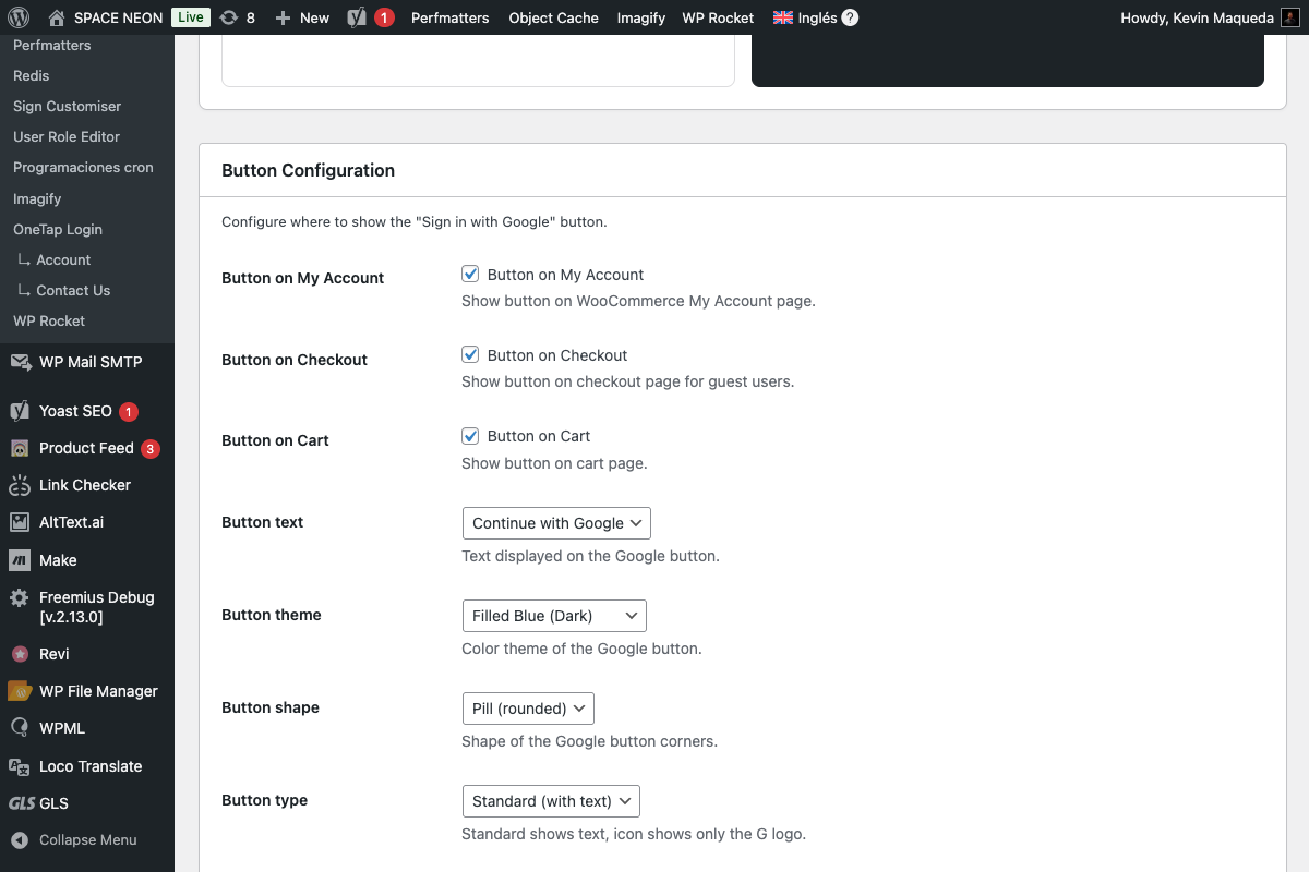
Button Customization
OneTap Login offers extensive customization options for the "Sign in with Google" button. This guide covers all available styling options.
Button Preview Panel
The settings page includes a live preview showing your button in real-time:
Features:
- Updates instantly as you change settings
- Shows button on both light and dark backgrounds
- Displays actual Google button component
FREE Customization Options
These options are available in the free version.
Button Text
Field: Button text
Default: continue_with
Controls the text displayed on the button.
| Value | Displayed Text | Best For |
|---|---|---|
continue_with | "Continue with Google" | General use, returning users |
signin_with | "Sign in with Google" | Login pages |
signup_with | "Sign up with Google" | Registration pages |
signin | "Sign in" | Compact layouts |

Use "Continue with Google" for most sites—it works for both new and returning users.
Button Theme
Field: Theme
Default: filled_blue
Controls the button's color scheme.
Outline (Light)
Theme: outline

- White background
- Gray border
- Dark text
- Best for: Dark backgrounds, minimalist designs
Filled Blue
Theme: filled_blue
- Google blue background (#4285F4)
- White text
- High visibility
- Best for: Most websites, calls-to-action
Filled Black
Theme: filled_black

- Black/dark background
- White text
- Neutral appearance
- Best for: Modern designs, dark themes
Button Shape
Field: Shape
Default: pill
Controls the button's corner style.
Pill (Rounded)
Shape: pill

- Fully rounded corners
- Modern appearance
- Friendly, approachable feel
Rectangular
Shape: rectangular

- Square corners
- Traditional appearance
- Professional, corporate feel
PRO Customization Options
These options require OneTap Login PRO.
Button Type
Field: Button type
Default: standard
| Type | Description | Dimensions |
|---|---|---|
standard | Full button with text | Variable width |
icon | Google "G" logo only | Fixed square |
Icon mode:
- Compact for tight spaces
- Shows only the Google "G"
- Good for social login button rows
Button Size
Field: Button size
Default: large
| Size | Height | Use Case |
|---|---|---|
large | 40px | Default, most visible |
medium | 32px | Compact layouts |
small | 20px | Inline with text |

Button Width
Field: Button width
Default: auto
| Option | Behavior |
|---|---|
auto | Fits content |
| Fixed (px) | Specific width (200-400px) |
100% | Full container width |
Custom width examples:
200px - Compact
300px - Standard
400px - Wide
100%  - Full width
Button Alignment
Field: Button alignment
Default: center
| Alignment | CSS |
|---|---|
left | text-align: left |
center | text-align: center |
right | text-align: right |

Logo Alignment
Field: Logo alignment
Default: left
Controls where the Google "G" logo appears:
| Alignment | Appearance |
|---|---|
left | [G] Continue with Google |
center | Continue [G] with Google |
Theme Compatibility
Light Backgrounds
Recommended settings:
Theme: filled_blue or filled_black
Shape: pill or rectangular
The blue and black themes provide good contrast on white/light backgrounds.
Dark Backgrounds
Recommended settings:
Theme: outline
Shape: pill or rectangular
The outline theme provides visibility on dark backgrounds.
Brand Color Matching
| Your Brand | Recommended Theme |
|---|---|
| Blue-focused | filled_blue |
| Minimalist | outline |
| Dark/modern | filled_black |
| Colorful | outline (neutral) |
CSS Customization
For advanced styling, you can add custom CSS:
/* Container wrapper */
.onetap-button-wrapper {
    margin: 20px 0;
}

/* Button alignment override */
.onetap-button-wrapper.align-center {
    text-align: center;
}

/* Responsive adjustments */
@media (max-width: 480px) {
    .onetap-button-wrapper {
        width: 100%;
    }
}
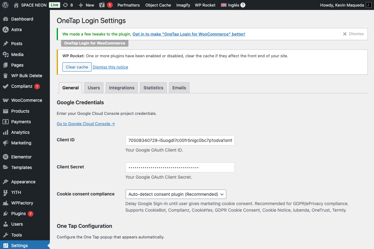
Google requires specific branding for their sign-in buttons. Major visual changes may violate their guidelines. The plugin's options are pre-approved by Google.
Skeleton Loading (CLS Prevention)
The plugin includes a skeleton placeholder to prevent layout shift:
How it works:
- Placeholder shown immediately on page load
- Same dimensions as final button
- Google button loads and replaces placeholder
- No layout shift (good Core Web Vitals)
Skeleton appearance:
- Gray background
- Matches button dimensions
- Subtle pulse animation
Configuration Examples
Default E-commerce
Text: continue_with
Theme: filled_blue
Shape: pill
Size: large (PRO)
Alignment: center (PRO)
Best for: Most WooCommerce stores
Corporate / B2B
Text: signin_with
Theme: filled_black
Shape: rectangular
Size: large (PRO)
Alignment: left (PRO)
Best for: Professional services, B2B portals
Minimalist Blog
Text: signin
Theme: outline
Shape: pill
Size: medium (PRO)
Alignment: center (PRO)
Best for: Clean, minimal designs
Mobile-First
Text: continue_with
Theme: filled_blue
Shape: pill
Size: large (PRO)
Width: 100% (PRO)
Best for: Mobile-optimized sites
Settings Summary
| Setting | Options | Default | Version |
|---|---|---|---|
| Button text | 4 options | continue_with | FREE |
| Theme | 3 options | filled_blue | FREE |
| Shape | 2 options | pill | FREE |
| Type | 2 options | standard | PRO |
| Size | 3 options | large | PRO |
| Width | auto/fixed/100% | auto | PRO |
| Alignment | 3 options | center | PRO |
| Logo alignment | 2 options | left | PRO |
Preview Checklist
Before saving, verify in the preview:
- Button visible on light background
- Button visible on dark background (if applicable)
- Text is readable
- Size appropriate for your layout
- Alignment matches your design
Next Steps
- Pages & Locations - Where to display buttons
- Error Messages - Customize error text
- Shortcode (PRO) - Custom button placement